Creating a Stunning Homepage for Your QuickServers Website: Dos and Don'ts
Your homepage is the first impression visitors get of your website, so it's crucial to make it visually appealing and user-friendly. Here are some essential dos and don'ts to help you create a stunning homepage for your QuickServers website.
Dos
1. Do Use a Clean and Simple Layout
A clean and simple layout makes your homepage easy to navigate and visually appealing.
- Whitespace: Use ample whitespace to prevent clutter and enhance readability.
- Consistent Structure: Maintain a consistent structure with well-defined sections for easy navigation.
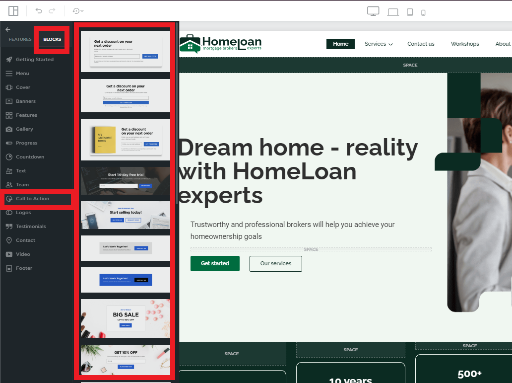
2. Do Include a Clear Call to Action (CTA)
Guide your visitors towards the desired action with clear and compelling CTAs.
- Prominent Buttons: Use prominent buttons for actions like “Sign Up,” “Learn More,” or “Contact Us.”
- Actionable Text: Ensure the text is action-oriented and encourages visitors to take the next step.
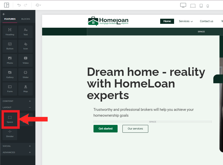
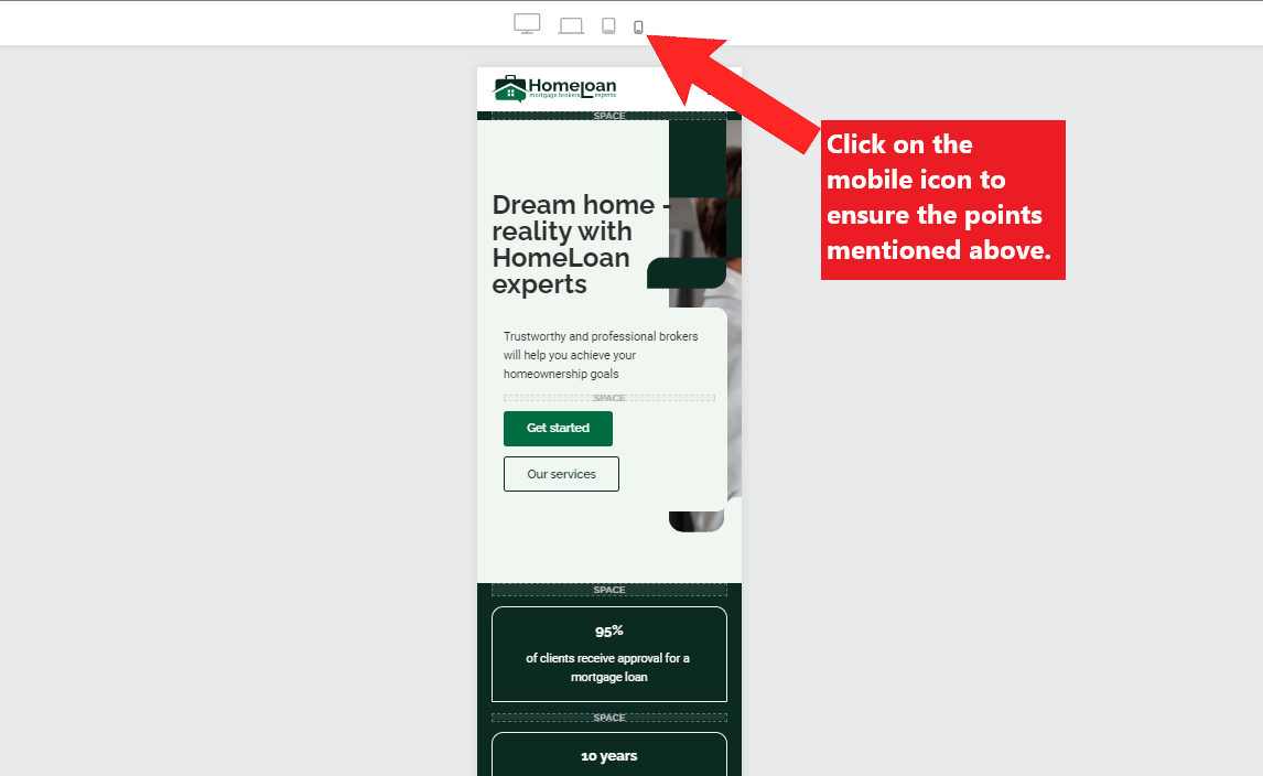
3. Do Optimize for Mobile
Ensure your homepage looks great and functions well on all devices.
- Responsive Design: Use a responsive design that adapts to different screen sizes.
- Mobile-Friendly Elements: Optimize images, buttons, and text for mobile users.
4. Do Use High-Quality Images
High-quality images can make your homepage more attractive and professional.
- Relevant Images: Use images that are relevant to your content and resonate with your audience.
- Professional Photography: Opt for professional photography or high-quality stock images.
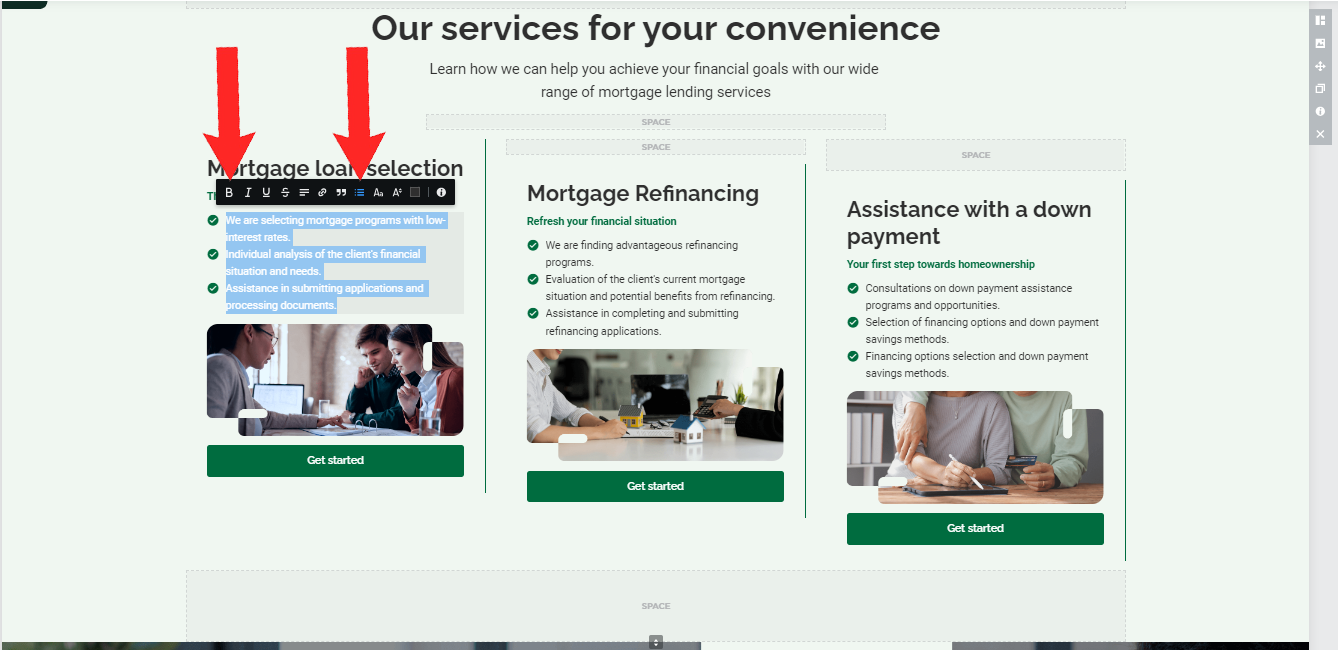
5. Do Highlight Key Information
Ensure visitors can quickly find the most important information.
- Headlines: Use clear and concise headlines to convey the main message.
- Bullet Points: Utilize bullet points to list key features or benefits.
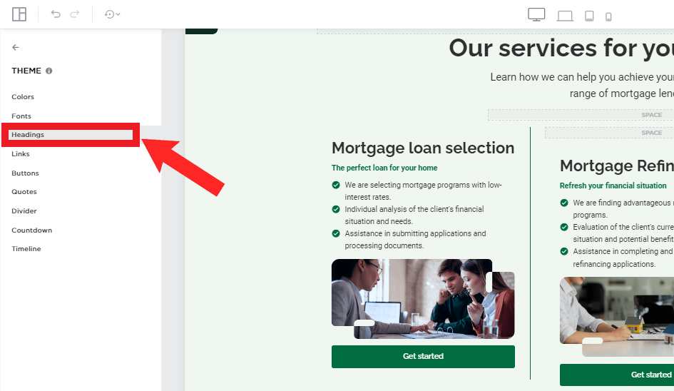
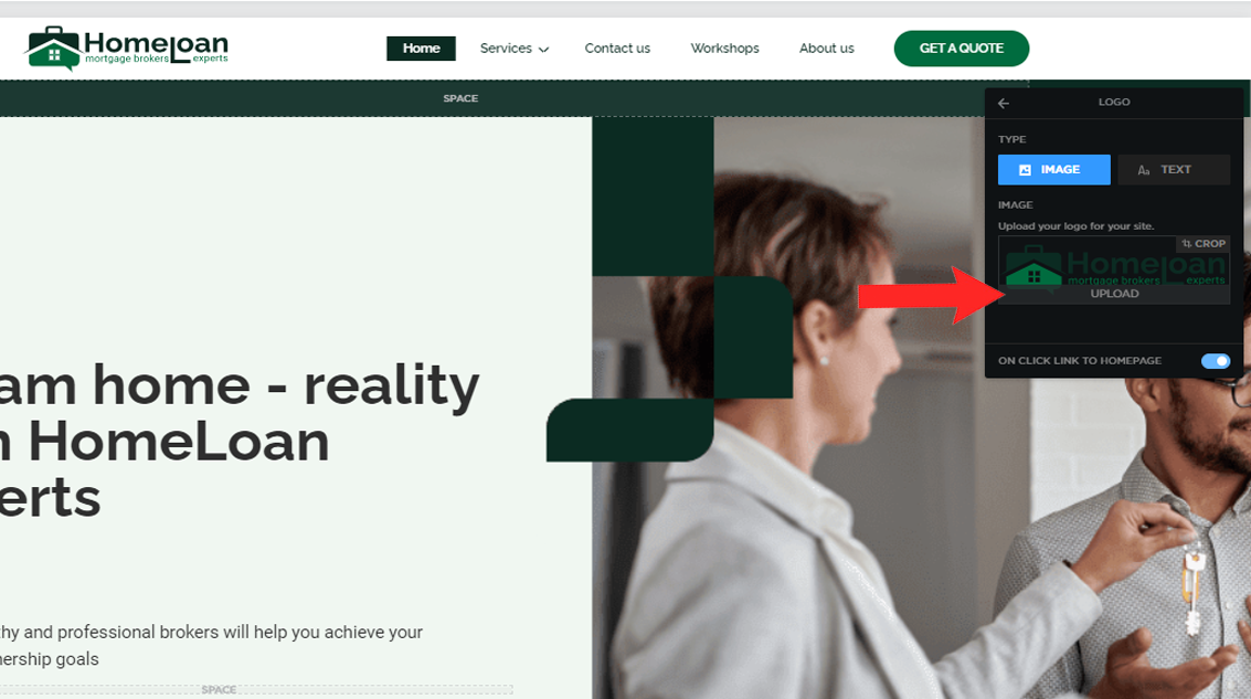
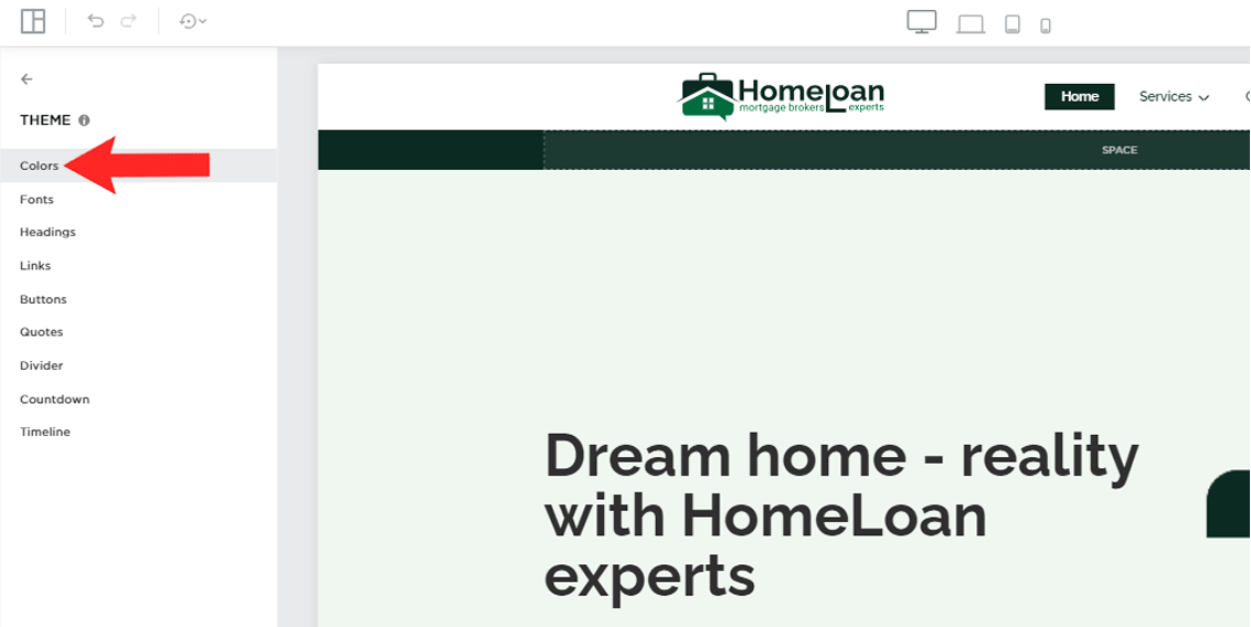
6. Do Incorporate Your Branding
Consistent branding helps establish trust and recognition.
- Logo: Display your logo prominently on the homepage.
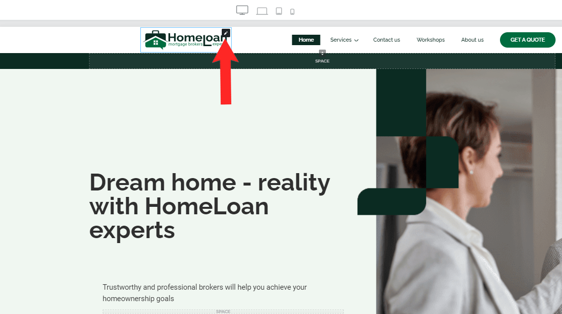
- Color Scheme: Use your brand’s color scheme consistently across the page.
Don'ts
1. Don’t Overload with Text
Too much text can overwhelm visitors and detract from the visual appeal.
- Keep it Concise: Use short paragraphs and bullet points to convey your message.
- Visual Breaks: Include images and whitespace to break up text and make it more digestible.
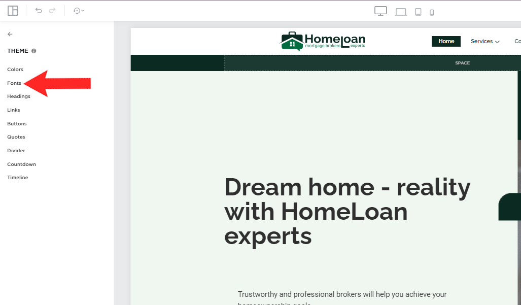
2. Don’t Use Too Many Fonts
Using too many different fonts can make your homepage look unprofessional and chaotic.
- Limit Font Choices: Stick to two or three fonts for a cohesive look.
- Consistent Styling: Maintain consistent font styles for headings, subheadings, and body text.
3. Don’t Ignore Loading Times
A slow-loading homepage can frustrate visitors and increase bounce rates.
- Optimize Images: Compress images to reduce load times without sacrificing quality.
- Minimalist Design: Avoid excessive use of heavy elements like videos and large image files.
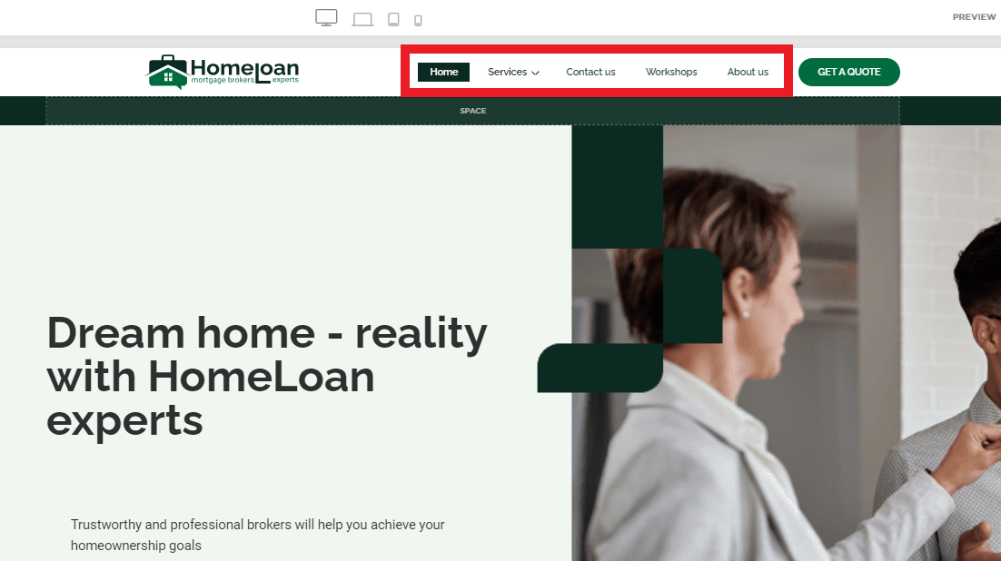
4. Don’t Neglect Navigation
Poor navigation can lead to a frustrating user experience.
- Clear Menu: Ensure your menu is easy to find and navigate.
- Internal Links: Use internal links to guide visitors to other important pages on your site.
5. Don’t Overcomplicate the Design
Overcomplicating the design can distract visitors from your main message.
- Simple Elements: Stick to simple design elements that enhance, rather than detract from, your content.
- Focus on Usability: Prioritize usability and ensure visitors can easily find what they need.
Conclusion
By following these dos and don'ts, you can create a stunning homepage for your QuickServers website that not only looks great but also provides an excellent user experience. Focus on clean design, clear messaging, and user-friendly navigation to make a lasting impression on your visitors. Happy designing!
