Making Your QuickServers Website Mobile-Friendly
Creating a mobile-friendly website is crucial in today’s digital landscape, as more users access the internet via mobile devices. Here’s a guide to help you make your QuickServers website mobile-friendly.
1. Use a Responsive Design
Responsive design ensures your website adapts to different screen sizes and resolutions.
Steps:
- Choose a Responsive Template: Select a template designed to be responsive from the QuickServers website builder.
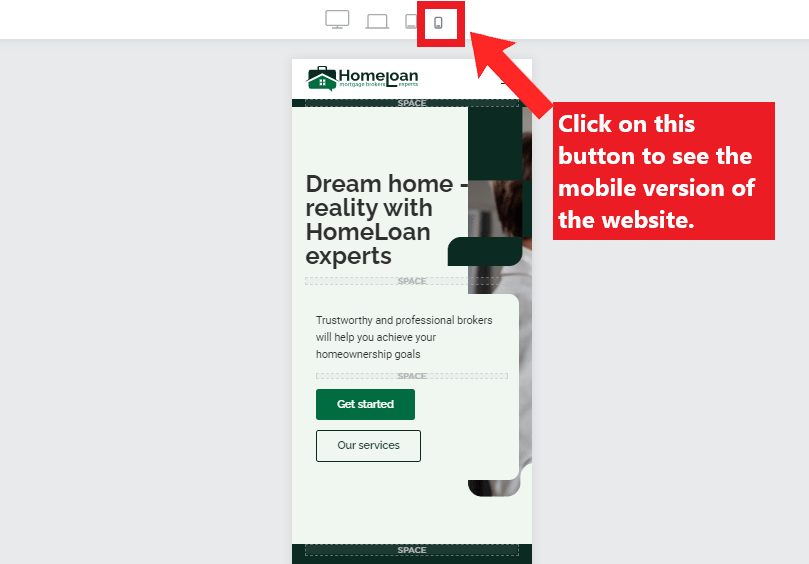
- Test Responsiveness: Use tools like Google’s Mobile-Friendly Test to check how your site performs on various devices.
2. Optimize Images and Media
Large images and media files can slow down your site on mobile devices.
Tips:
- Compress Images: Use tools like TinyPNG or JPEGoptim to reduce image file sizes without losing quality.
- Use Appropriate Formats: Opt for modern formats like WebP for better compression.
3. Simplify Navigation
Easy navigation is essential for mobile users who interact with smaller screens.
Suggestions:
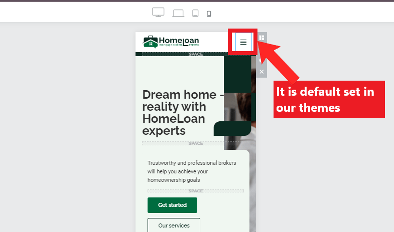
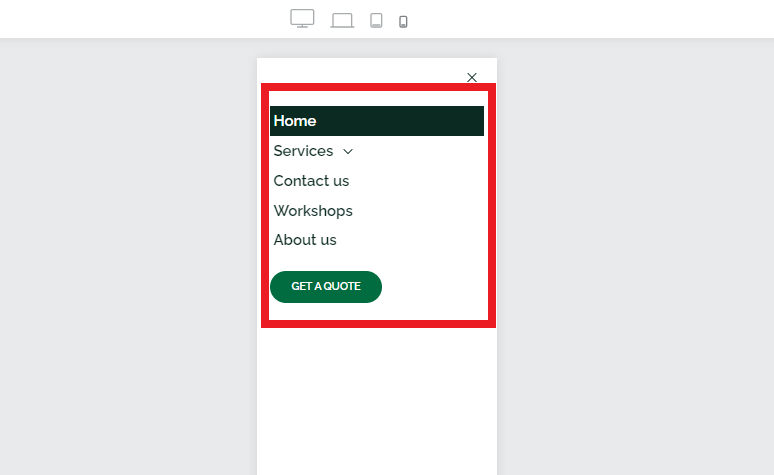
- Hamburger Menu: Implement a hamburger menu to keep navigation clean and accessible.
- Clickable Elements: Ensure buttons and links are large enough to be easily tapped.
4. Improve Load Times
Fast loading times are critical for mobile users who may have slower internet connections.
Techniques:
- Minimize HTTP Requests: Reduce the number of elements on your page to decrease load times.
- Enable Browser Caching: Cache static resources to improve load times for returning visitors.
5. Use Mobile-Friendly Fonts
Readable text is essential for a good mobile experience.
Best Practices:
- Legible Font Size: Use a font size of at least 16px to ensure readability.

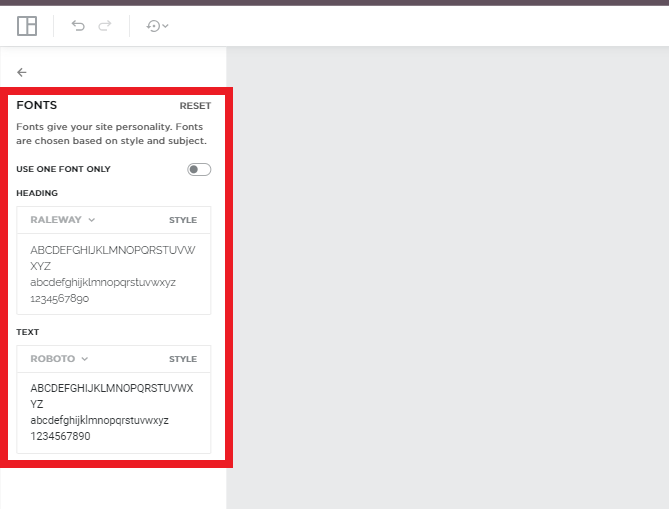
- Clear Typography: Choose fonts that are clear and easy to read on small screens.
6. Enable Touch-Friendly Interactions
Make sure your website elements are easy to interact with on touch screens.
- Size Buttons Appropriately: Ensure buttons are large enough to be easily tapped without zooming.
7. Test on Multiple Devices
Testing ensures your site performs well across different mobile devices and browsers.
Methods:
- Cross-Device Testing: Test your website on various devices, including smartphones and tablets.
- Browser Testing: Ensure compatibility across different mobile browsers like Chrome, Safari, and Firefox.
8. Monitor and Optimize
Regularly monitor your site’s performance and make necessary adjustments.
Tools:
- Analytics Tools: Use Google Analytics to track mobile user behavior and identify areas for improvement.
- Performance Tools: Utilize tools like Lighthouse to audit and optimize mobile performance.
Conclusion
Making your QuickServers website mobile-friendly enhances user experience, boosts engagement, and improves search engine rankings. By following these tips and best practices, you can ensure your site is accessible, fast, and user-friendly on all mobile devices. Happy optimizing!
