How to Check and Edit Your Website’s Mobile Layout
With the increasing number of users accessing websites through mobile devices, it’s crucial to ensure that your website is fully optimized for mobile viewing. Checking and editing your website’s mobile layout can greatly enhance user experience. Here’s a step-by-step guide on how to check and edit your website’s mobile layout.
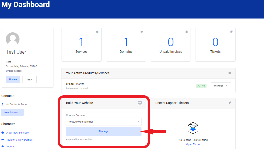
Step 1: Log In to Your Website Dashboard
- Log in to your website’s dashboard using your credentials.
- The dashboard is where you can manage all aspects of your site, including mobile layout, content, and design settings.
- Ensure you have access to the website builder’s mobile optimization features.
Step 2: Locate Mobile Layout Settings
- In the dashboard, navigate to the settings or editor section where you can edit the design.
- Look for a "Mobile View" or "Mobile Settings" option in your website builder. Many platforms allow you to toggle between desktop and mobile views to make adjustments.
- Some website builders offer a separate mobile editor to customize the layout specifically for mobile devices.
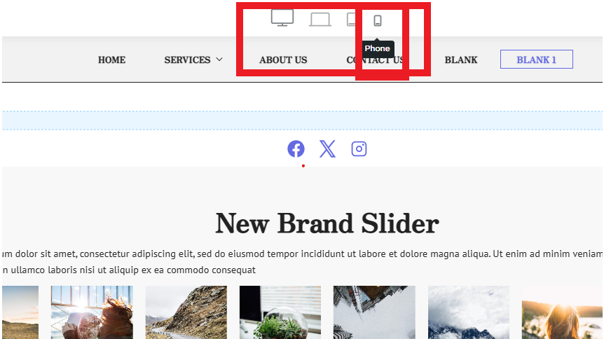
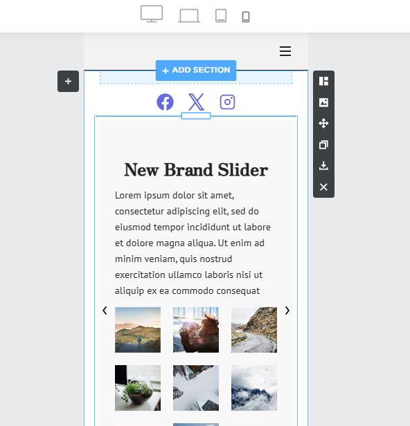
Step 3: Preview Your Website on Mobile
- Switch your view from desktop to mobile to preview how your site appears on smartphones and tablets.
- Most website editors allow you to simulate mobile views directly within the editor so you can see how the layout looks in real-time.
- Take note of any issues such as text being cut off, images not scaling properly, or buttons being too close together.
Step 4: Check Text and Font Size
- Ensure that the text is legible on smaller screens.
- Increase font size if necessary so that the text is easy to read without zooming.
- Avoid using overly large fonts that may cause content to spill off the screen or make the layout appear cluttered.
Step 5: Adjust Images and Media for Mobile
- Review how images and videos appear on mobile devices. They should automatically resize, but you might need to manually adjust some elements.
- Make sure images are properly aligned and don't stretch out of proportion.
- You may need to crop or resize certain images so they fit properly on smaller screens.
Step 6: Check Navigation Menu
- Test how the navigation menu appears on mobile devices.
- Ensure that your menu is easy to access, either through a hamburger (three-line) menu or another mobile-friendly navigation style.
- Make sure all menu items are visible and accessible without excessive scrolling.
Step 7: Adjust Button and Link Sizes
- Ensure that buttons and links are large enough to be easily tapped on mobile devices.
- Avoid making buttons too small or placing them too close to other elements, as this can lead to difficulty in navigation.
- Add padding around buttons to make them more user-friendly on touch screens.
Step 8: Test the Layout for Responsiveness
- Check if your website layout is responsive, meaning it adapts smoothly to different screen sizes (from mobile to tablet to desktop).
- Ensure that the content reflows appropriately and does not require horizontal scrolling.
- Test on multiple mobile devices to verify the layout remains consistent.
Step 9: Edit for Mobile Optimization
- If you find any issues in the mobile view, use the editor tools to make adjustments.
- Most website builders allow you to make mobile-specific changes without affecting the desktop layout, so you can customize fonts, images, and more for mobile optimization.
- Look for mobile-specific settings like spacing, column adjustments, and hidden elements for mobile users.
Step 10: Save and Preview Changes
- Once you’ve made the necessary adjustments, save your changes and preview the site again to make sure everything looks good.
- You can always test the site on an actual mobile device (or using mobile simulators) to ensure the user experience is smooth and functional.
- Make final tweaks based on your testing and ensure that the mobile layout provides a great user experience.
By checking and editing your website’s mobile layout, you can ensure that visitors on mobile devices have a smooth, user-friendly experience. Regularly testing and adjusting the mobile view helps you stay ahead of any layout issues and keeps your site optimized for all users.
